SL1 Device Investigator
up to ResumeWhat is going on with this device?!
Devices are the core of SL1. (Check out the Dashboards diatribe for more on SL1, and how I took over Device Management.)
One of the easiest way to describe our software to a layperson: “what the IT guy uses to see why the site is broken, and how to fix it”. When everyone owned their own datacenters, this was easier, but we have impressively kept up with the dominance of cloud tech, and monitor your AWS just as well as your box of VMs.
So, if you see a device, say a server, go red on your screen, you investigate it. And that’s why you’re looking at the Device Investigator saying “What is going on with this device?!”
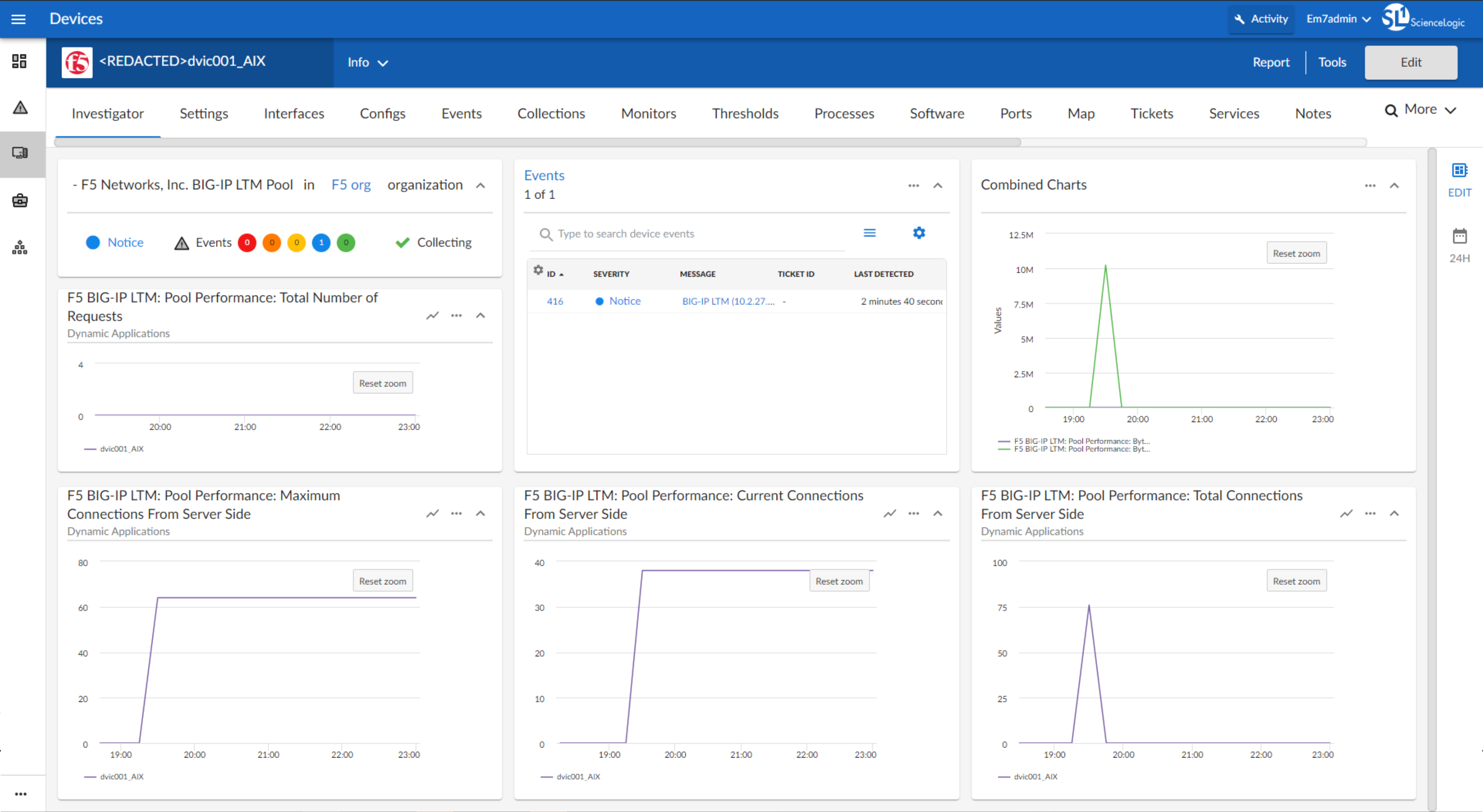
One page to rule them all.
Again, devices are the core of the product. There are many ways to view and interact with devices, and the Investigator has evolved to account for two primary use cases.
In the “classic” version of our UI, there are separate areas to see a “Summary” Device Dashboard and an interactive “Performance” chart analysis. In our user interviews, we found lots of overlap in the use cases.
- “Why do I need to click to a different area to zoom into this chart?”
- “Why do I need to click to a different area to customize this dashboard for next time?”
- “Why doesn’t it remember what I selected last time?”
We created a new concept to combine these visualization styles into a single page: the Device Investigator. Could it rule all the use cases?
The first version was much closer to an interactive (“Performance”) charting tool, with comparisons to other devices, and a focus on selecting metrics every time you visit the page. Feedback showed that for the intended use case, it was lacking in density and data diversity. But more importantly it also failed to tell a story every time, and required users to make selections
The next version swung towards the (“Summary”) pre-built dashboard version, with higher data density and a hierarchy system to show the most applicable data based on the type of device. When testing this concept, we found that the feedback was positive, and users asked unprompted for the next-up features that were planned for the next iteration. We also realized that much of the interactive (“Performance”) features would be better suited as an accessory to this Investigator, and the clouds cleared to reveal a confident path forward.
Unfortunately, the decision was made to pull this high-performing team onto a high-visibility project under a different leader, and some of the features that complete the narrative could not be built. My personal opinion is that this mistake left us with two half-finished projects instead of one that really shines, and that has borne out from the customer conversations I’ve had.
Lessons…
- Shockingly, sometimes it’s v2 or v3 that really nails it. But you won’t always get enough cracks at a problem before it’s time to move on.
- Sometimes it’s worth combining multiple areas into one. But it certainly involves compromises.
- Continuous customer feedback will make the important capabilities ring through the noise of 100 smaller features